5 Print & Packaging Design Tips for Beginners
5 Print & Packaging Design Tips for Beginners

The right print and packaging may turn even the most reluctant customers into die-hard fans. It is an excellent marketing tool that will help you sell more products and build a long-term consumer base that will return to your brand. The truth is that print and packaging have a bigger influence on customer decisions than you would believe.
However, it is important to understand that packaging entails more than finding a pretty box or printing envelopes with a brand logo. It conveys a lot of information, from what the product can do for your customers to your company's ideals. Some claim that the packaging is just as significant as the product because it serves as a vital marketing and communication tool for your company.
Tips for Print and Packaging Design
The good news is that coming up with print and packaging designs for your products is a lot easier than you may have imagined. Read on to uncover some secrets of smart package design to ensure that your products are always the first choice.
1. Know Your Customers
Before anything else, keep in mind that the needs of the consumer come first. When it comes to choosing between your product and your competitors, the customer is the one making the final decision. This makes it important to know your target audience and learn about their expectations from your brand before you start designing.
It will also make it easier to make design decisions. If you are selling to younger people, going for catchy and quirky designs might work in your favour. On the other hand, if you want to appeal to a more mature audience, it may be a good idea to opt for subtle hues and a more elegant design.
Consider the viewpoint of the client. For example, you may want to design re-sealable envelopes or packaging for products that aren't consumed right away after opening. Customers will remember your product more fondly if you can make the unwrapping process enjoyable or luxurious for them. If you’ve ever seen or experienced how Apple does this to perfection with their branding, or unboxing of a new iPhone, iPad, or Mac, you’ve got the idea. Nothing saying premium more than a wonderful unboxing experience.
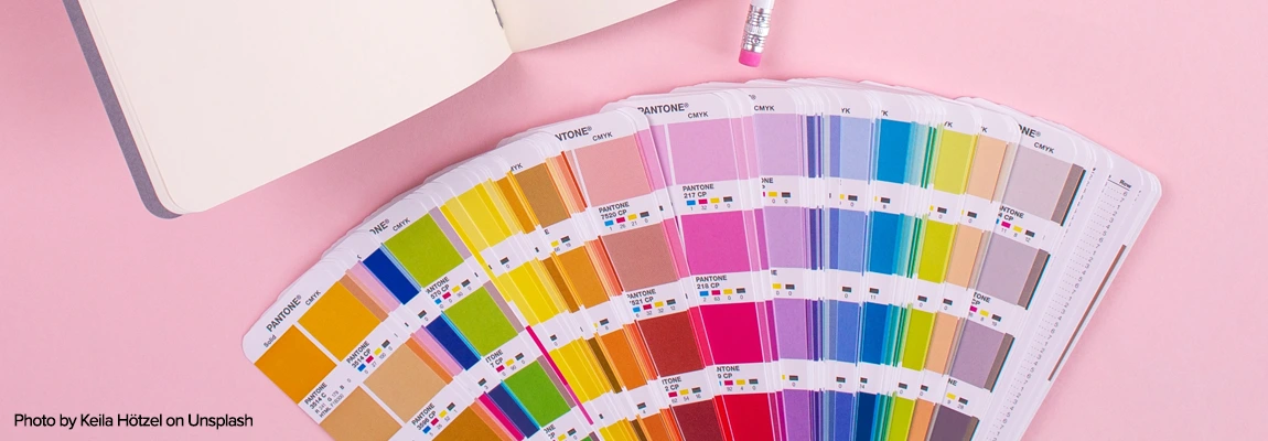
2. Colours are Key to Branding
The use of colour to effectively express your message is an important aspect of your packaging. The first thing your customers will notice is the colour. There's a reason we have preferred colours, and the way they influence our psyche may be quite effective. Colours can entice a buyer to buy or recommend your goods to a friend.
Light hues are often gentler and more calming, whereas dark colours show power and grandeur. Dark colours help your brand feel more established and trustworthy. Using light hues in your design will give it an airy, beautiful feel. They give brands a pure, unadulterated appearance. Ultimately, choosing the best colours depends on your products and the kind of experience you want for your clients.
If you want a more elegant, secretive, or serious experience, go for deeper and darker colours. On the other hand, if you're going for minimalism or trying to convey friendliness, choose lighter colours. When designing a product package, your brand colours are the most obvious choice. You've already chosen these colours with care to represent your brand and appeal to your target market.
Brand colours foster loyalty and recognition, prompting customers to turn to you first. However, keep in mind that the colours you see on the screen may slightly differ from the printed version. This makes it important to consider colour variations when designing. Check out our colour variation guide to learn more about it.
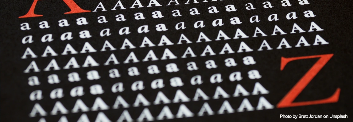
3. Choose the Right Font
Choosing the right font can be tricky yet a lot of fun. The key to selecting the right typeface is to keep things simple. When you use too many different typefaces, it might get confusing and untidy. One of the best approaches is to use two opposing styles with each other if you're utilising more than one font, such as a script font and a sans-serif. Plus, using different weights or thicknesses of typeface creates even more elegance, coherence, flow and structure.
Keep in mind that there are no hard and fast rules when it comes to typeface selection. Thousands of free fonts are available for download from the internet, which means there is no cap on creativity. One of the best font libraries includes Google Fonts. With 1000+ professional, downloadable Google fonts available (in the professional OpenType digital format, compatible with Macs or PCs), choosing the right font can be tricky and daunting, especially with the very subtle, specialised differences in many letterforms.
Therefore, here are a few suggestions to help you choose the right font for your print and package design:
Serif
Serif typefaces, such as Times New Roman, Garamond or Georgia, are easy to read and carry over to print products, making them a fantastic choice for packaging design. These fonts are sometimes referred to as the older style of fonts and are best used in body text. When used correctly, the tails of the letters make the text flow together and improve the overall readability of the body.
They have a more formal, classic, and serious appearance. This type of font will convey a sense of dependability and respectability, depending on the type of goods you sell. Some of the most popular, Serif Google Font Families include Roboto, Merriweather, Playfair Display, Lora, and PT Serif.
Sans-Serif
Sans Serif fonts are noted for their straight lines and clean edges. Brands often appreciate the look and versatility of these fonts. When you want your package to be simple and uncluttered, or when legibility is crucial, choose sans-serif typefaces.
Helvetica and Arial are examples of traditional sans-serif fonts, bundled with PCs and Macs, that are clean and sophisticated. On the other hand, some popular, modern, Sans-Serif Google Font families include Roboto, Open Sans, Lato, Source Sans Pro, Montserrat, and Poppins.
Script
Script typefaces tend to resemble handwriting. They are commonly found on high-end items and are preferred by brands for their individuality. Two of the most popular Script fonts are Snell Roundhand and Brush Script. Lobster and Lucinda script fonts also mimic classic handwriting and are associated with refinement and luxury.
You can also look for ‘handwriting’ options in Google Font families. Some of our favourite script fonts for packaging and design include Dancing Script, Architects Daughter, Praise, Pacifico, Indie Flower, and Patrick Hand.

4. Know What to Write on the Package
Printing brand information, logo, and even a creative copy to go with your brand is just another approach to maximising the product packaging design. It can help your customers see the advantages of your product and make a purchase. You can also include customised delivery notes in the box to make a lasting impression on your customers.
Again, what to write on the package or envelope depends on your products and the kind of impression you wish to make on your customers. For example, you can make your customers smile by using witty and sarcastic copy that will put a smile on their faces. On the other hand, if your brand needs to build trust, credibility, or confidence, you should use a more professional or serious copy.
Use an inspirational and passionate tone when you want to connect directly to your customer's emotional core. The more your audience knows about your story and the values that guide your brand, the more likely they are to rally behind it and support your goals. Here are some tips to help you write the perfect copy for your product package.
- Keep the copy as short as possible. Cut to the chase and tell the reader exactly what they're looking for.
- Strive to keep your sentences and words as brief as possible. Longer phrases are more difficult to follow, and a reader at a store may not have much time. Your text will be snappier if your sentences are shorter.
- Consider what your buyer expects from the product. Ask questions like what do they desire or require? What can you say to persuade them to purchase?
- Although you may not have a lot of room to compose your text, you can still tell a story with it. Try to entice the reader in by allowing them to visualise themselves utilising the goods.
- Make use of tools to assist you in writing perfect copy. There are numerous tools available online to assist you in writing copy that sells. You can try Grammarly, Grammarix, State Of Writing, and more.
After you've finished composing your text, double-check that you've edited it appropriately. Allow yourself enough time to step away from it for a bit, then return to it and begin proofreading.
5. Choose the Right Quality for your Print Packaging
Even if your design is fantastic, it won't sell if the print quality is poor. Once you've decided on a final design, work with a printing company specialising in envelope and package printing to ensure high print quality. Consider this at the outset of the design process to guarantee that your hard work pays off in the best possible way. Trade Printing UK can help you make the most of your print and packaging.
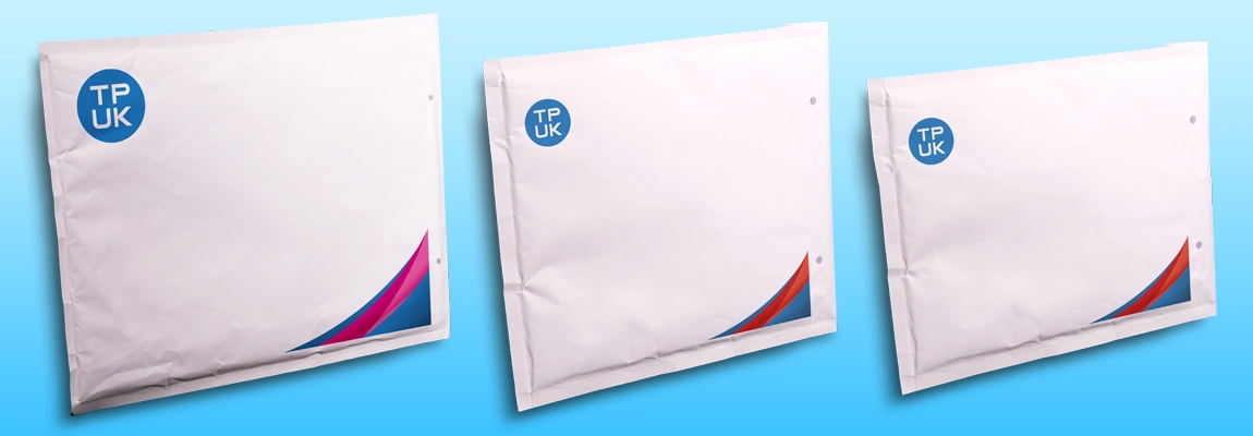
We offer a range of printing services and specialise in printing board back envelopes and Gusset Envelopes. Visit Trade Printing UK today to learn more about our customised printing services and receive a quote.