Colour Variation Guide - Monitor Screen vs Print
Colour Variation Guide
Monitor Screen vs Print
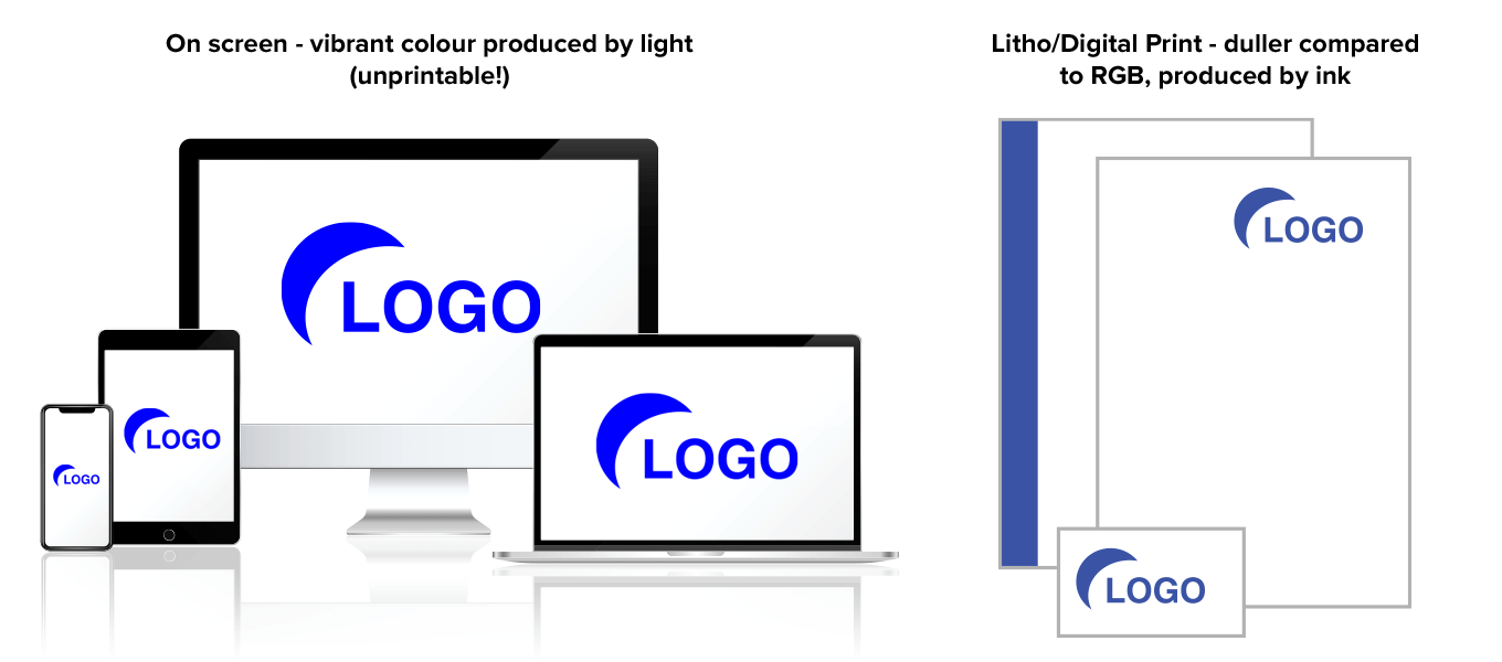
How the colours you see on screen can differ from the final print production job.
Colours you see on your computer monitor, inkjet or laser printer may vary slightly in colour and tone from what will be printed and produced using our digital (full colour Carbonless NCR & Envelopes) or Litho (Roll Labels & Stationery) processes of printing.
Colour calibration can vary from screen to screen, with there also being a difference in how a colour is displayed between LCD or LED monitors and phone/tablet screens - basically don’t expect the final print job to turn out 100% the same as your screen displays it!
Variation on Uncoated or Laminated Materials
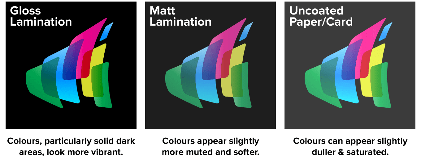
Adding a gloss lamination or printing on gloss material (e.g printed flyers) has the effect of making colours look more vibrant, particularly solid dark areas like a black background.
Matt laminations are mainly applied to business cards and slightly soften the look and feel, appearing more understated and professional.
Uncoated materials such as letterheads or the Carbonless NCR products and Envelopes that we specialise in can cause inks to appear slightly duller and saturated. They still look great, but there is a difference if for example you were making a direct comparison between how your logo looked on a gloss flyer compared to an envelope.
Digital Print Colour Variation
With advances in digital technology the gap is closing all the time between litho and digital print.
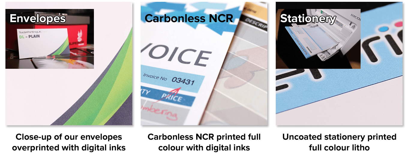
We print our Carbonless NCR and Envelopes digitally because it allows for quality full colour printing at a much lower price point, as well as making smaller print runs more efficient to produce and cost effective.
As stated in the section above, printing on to uncoated materials can cause inks to appear slightly duller and saturated, whether printed litho or digitally, but unless you're doing a side-by-side comparison you won't really notice the difference.
Tonal Variation in Printing
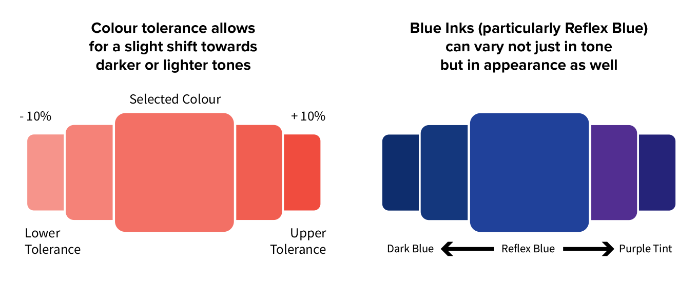
All reasonable efforts shall be made by us to obtain the best possible colour reproduction on every job, but colour variation is inherent in the Litho printing process especially.
This is due to a number of reasons, such as physical dot gain, press & ink tolerances, large solid blocks of colour across long print runs etc.
It should be noted that getting a 100% match on colour from an existing job, whether printed by us or another company, is unlikely.
Certain colours, such as Reflex Blue, can have quite a large variance in colour – not just by being lighter or darker – but appearing to be a slightly different tint from what you may expect.
Digital printing (which we use for our full colour Carbonless NCR products and Envelopes) tends to be more consistent and we keep detailed records of our settings with each job so that repeat orders look the same (or as close as possible) each time.